6 Core Principles of UX Design
Chaitanya N.
Dec 08, 2025

Why UX Design Matters
Great digital products feel simple to use. When someone opens an app to book a ride, order food, or check the weather, they should immediately know what to do next. The screens should feel clear, the actions should feel natural, and nothing should feel confusing. This smooth experience doesn’t happen by chance — it is created through thoughtful user experience (UX) design. UX is what shapes how people interact with a product and how comfortable and confident they feel while using it.
When UX is poor, the impact is just as clear. Users struggle to find what they need, tap the wrong buttons, or feel frustrated within seconds. Many leave and never return. Good UX prevents these problems. It simplifies complex tasks, reduces effort, and helps users move forward without stress. For businesses, this leads to higher engagement, stronger trust, and better results. For users, it means technology that feels helpful, not difficult.
Here are some core UX principles that everyone should know to design experiences that truly work for users.

1. Consistency
What It Means
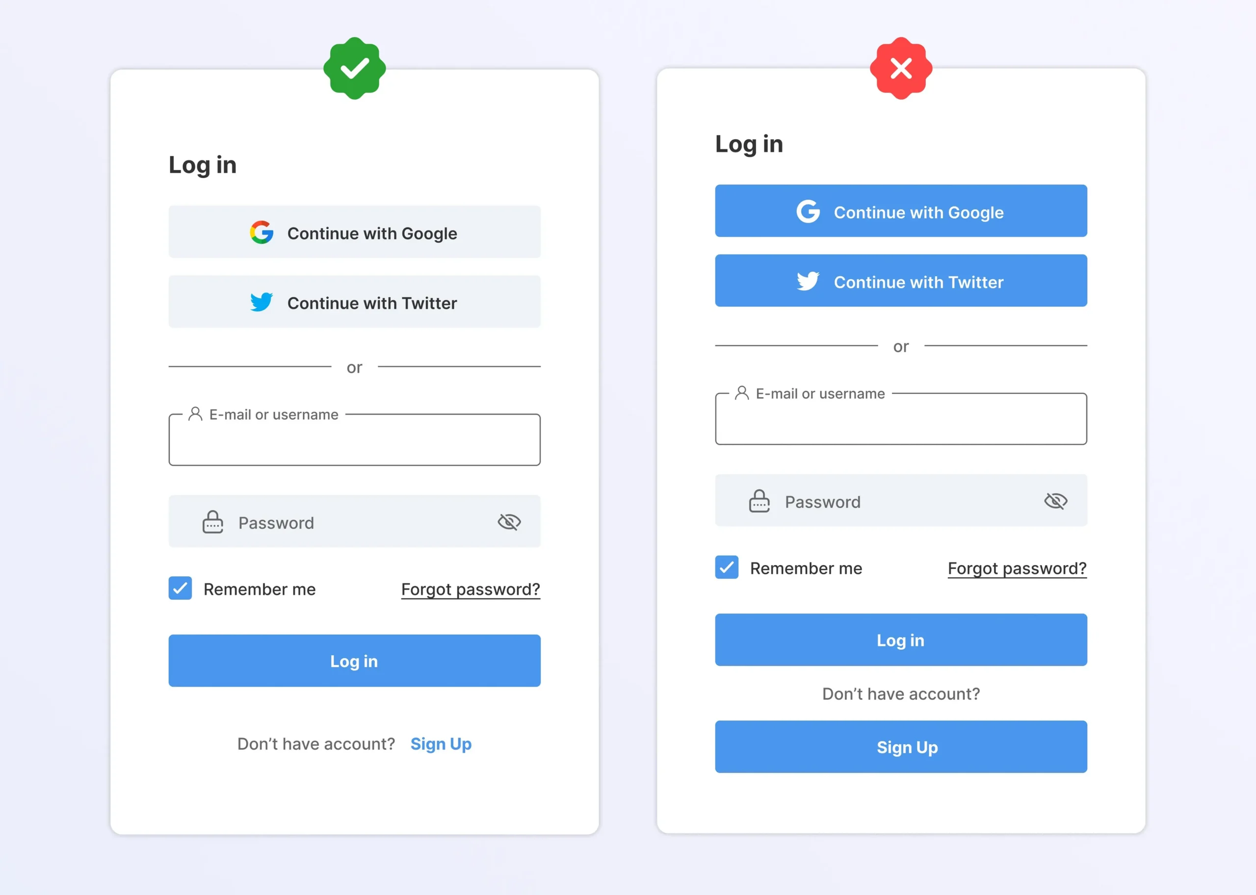
Consistency ensures users encounter familiar patterns, visuals, and behaviors throughout the product. When elements behave predictably, users feel more confident and require less mental effort.
Practical Examples
- Using the same color for primary actions across all screens.
- Uniform spacing, typography, and icon styles.
- Reusing established UI patterns like cards, tabs, and bottom navigation.

Why It Matters
Consistency reduces learning time and helps users build muscle memory. When users don’t have to re-learn interactions, they can focus on accomplishing tasks quickly and comfortably.
2. Hierarchy
What It Means
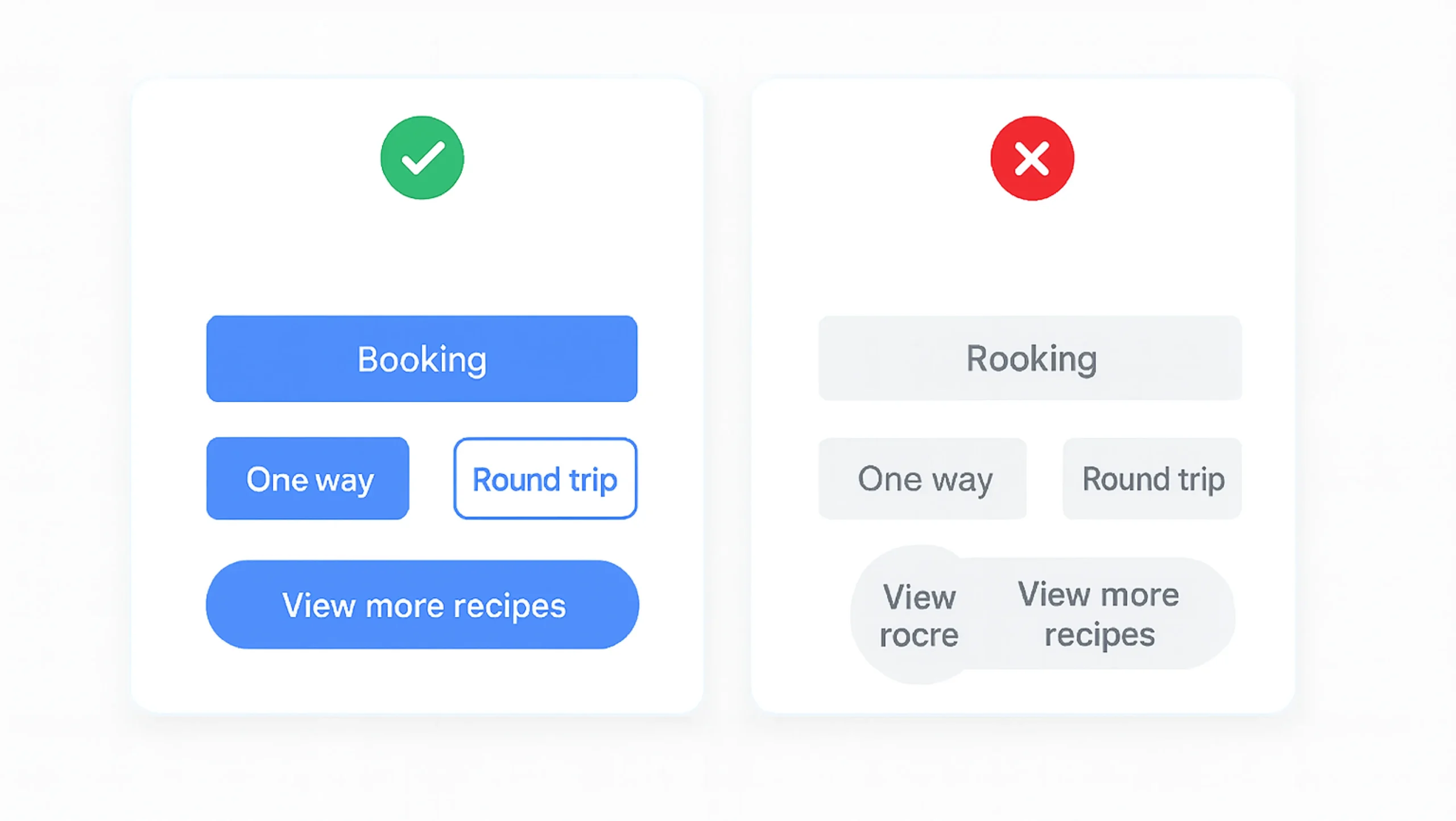
Hierarchy organizes information so users instantly know what’s important. It leverages contrast, size, placement, and spacing to direct attention.
Practical Examples
- Bold, large headlines followed by smaller descriptive text.
- Prominent primary CTA with secondary actions shown as text links
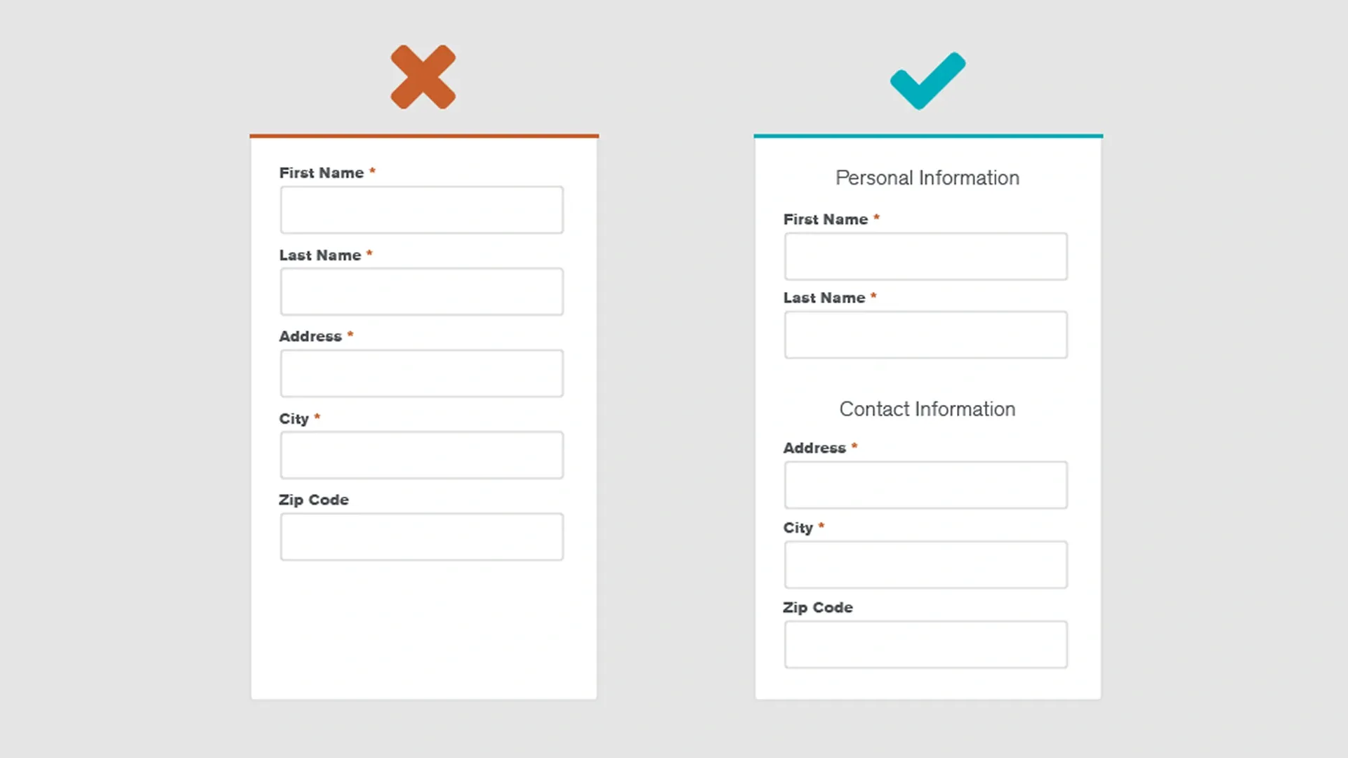
- Grouping related content using cards or section dividers.

Why It Matters
Good hierarchy prevents cognitive overload. It helps users scan pages efficiently, understand relationships between content, and make decisions without unnecessary friction.
3. User Control
What It Means
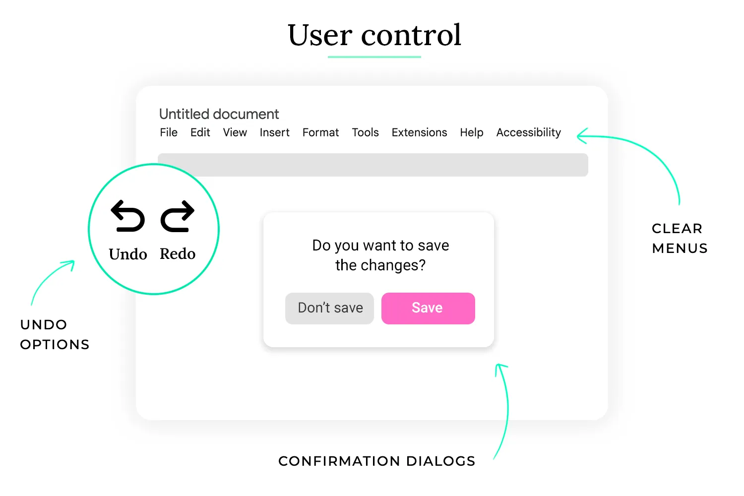
User control gives users the ability to make choices, undo mistakes, and navigate on their own terms. The interface should empower — not restrict — the user.
Practical Examples
- Undo and redo options for actions like edits or deletions.
- Allowing users to skip, go back, or exit a flow at any time.
- Customizable notifications or settings.

Why It Matters
Users feel more confident when they remain in charge. Control increases trust, reduces frustration, and makes interactions feel flexible rather than rigid.
4. Accessibility
What It Means
Accessibility ensures that people of all abilities — including those with visual, auditory, cognitive, or motor impairments — can use the product effectively.
Practical Examples
- Minimum 4.5:1 color contrast for readable text.
- Large touch targets (56×56px) for easier tapping.
- Screen-reader-friendly labels and logical focus order.

Why It Matters
Accessible design is inclusive design. It improves usability for everyone, supports ethical design standards, and ensures compliance with global accessibility guidelines. It also expands your product’s potential audience.
5. Usability
What It Means
Usability is about how easy and efficient a product is to use. It focuses on ensuring users can accomplish tasks without confusion or unnecessary steps.
Practical Examples
- Clear navigation labels such as “Profile,” “Orders,” or “Settings.” etc.
- Simple forms with minimal required fields.
- Fast load times and responsive interactions across devices.
Why It Matters
A usable product reduces friction and lowers dropout rates. Users stay engaged longer, complete tasks more efficiently, and are more likely to return. Usability directly impacts satisfaction and overall product success.
6. Context
What It Means
Context ensures users always understand where they are, what they can do, and what will happen next. A contextual interface adapts to the user’s moment, goal, and environment.
Practical Examples
- Showing location-aware suggestions (e.g., “Near you” in a travel app).
- Displaying inline validation when a form field is incorrect.
- Surfacing relevant actions based on the user’s current task.

Why It Matters
When users lack context, they feel lost or confused. Providing cues and relevant information builds clarity and reduces errors, making the experience more intuitive and aligned with user goals.
Final Thoughts
Great UX doesn’t happen by accident — it’s the result of intentional, user-centered decisions. Consistency builds trust, hierarchy brings clarity, context reduces confusion, user control empowers, accessibility includes, and usability delights.

When these principles work together, they create experiences that feel natural and effortless. Whether you’re a beginner or an experienced designer, mastering these foundations will help you design products that users love — and keep returning to.
